Ethnic Communities’ Council of Victoria (ECCV)
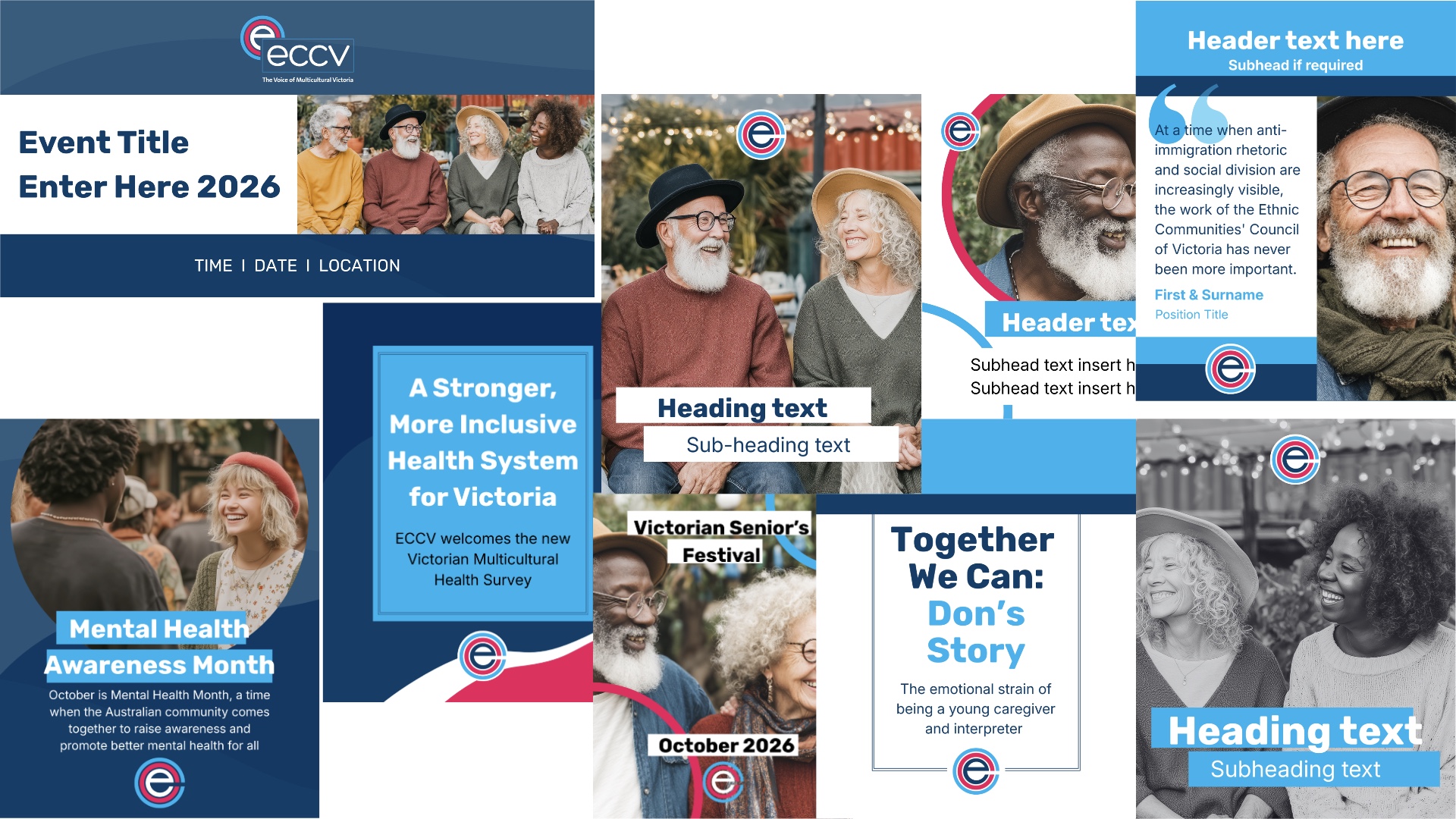
Ethnic Communities’ Council of Victoria (ECCV) is proud to be the peak body for the state’s migrant and refugee communities. Since 1974, they have been advocating for the rights of multicultural communities, informing industry practice and influencing governments at all levels on a range of issues,
including anti-racism, equitable access to services and socially just policy.
ECCC required a range of social media post templates to freshen up their communication visual identity, within their current brand identity and voice.
Clean lines, bold shapes, clear text and visual hierarchy lead the designs to strong and well received outcomes. An invitation banner accompanies the new suite of templates for the organisation. Seperate graphic elements used within the designs were supplied, to assist with future post styles within the new graphic direction.
Source: https://eccv.org.au/
Multicultural Youth Advocacy Network (MYAN)




Multicultural Youth Advocacy Network (MYAN) is Australia’s leading voice for young people from refugee and migrant backgrounds.
MYAN’s purpose is to champion the rights and interests of young people from refugee and migrant backgrounds. MYAN have been supporting the Australian migrant population for over 15 years through a commitment to advocacy, capacity building, and community engagement. In doing so, ensuring their voices resonate nationally and internationally, and young people are able to thrive and meaningfully engage in the socio-economic and cultural fabric
of Australia.
MYAN required a brand refresh to enable their content creators dynamic opportunities for posting across social media. A vibrant, non-suggestive, natural and organic selection of shapes was created that could easily be adapted across various platforms and visual mediums. The illustrative elements adapt well to the vibrant colour palette the brand boasts.
Source: https://myan.org.au/
Adult Education
Garden to Plate Program
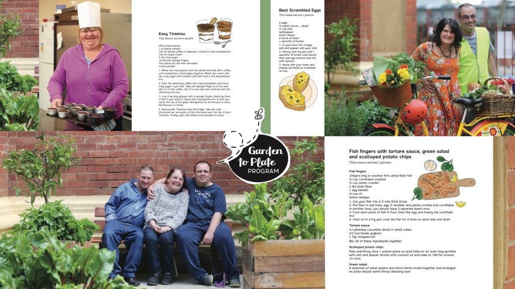
The Southern Grampians Adult Education Garden to Plate Program was s a lifestyle program, with a primary focus to provide a positive learning environment for adult students to achieve outcomes for each of the participant’s intellectual level.
Embedded outcomes included: literacy, numeracy, travel, banking, hygiene, healthy eating and food preparation. Participants grew a percentage of the ingredients and were involved in the preparation of appropriate meals.
The design brief was to create a logo and recipe book-cum-memento publication of the program. Beautiful portraits and group shots of the participants led the fresh and clean design. Illustrations were created to add some visual fun to the recipes. The logo was light, visual and playful.
Anglicare Nothern Territory
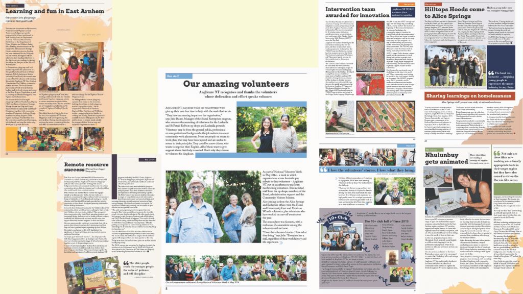
Anglicare Northern Territory required a spirited and engaging design to help mark the special occasion of their 25th year as an organisation. This annual report was also the first to be produced with their refreshed identity.
A clean and open design was implemented; utilising a fresh combination of the brand’s primary and secondary colour palette. Typography use included a serif typeface for body copy and sans-serif for break out stories, offering a consistent alternative type styling to keep the layout dynamic. Images throughout the report reflect the positive and life-changing work the organisation does throughout its community and beyond.
Through specific design choices, the report communicates to its audience of clients, organisation stakeholders, volunteers and general community in an inclusive, fresh and honest tone.
Anglicare Victoria –
Dad’s Putting Kids First Program
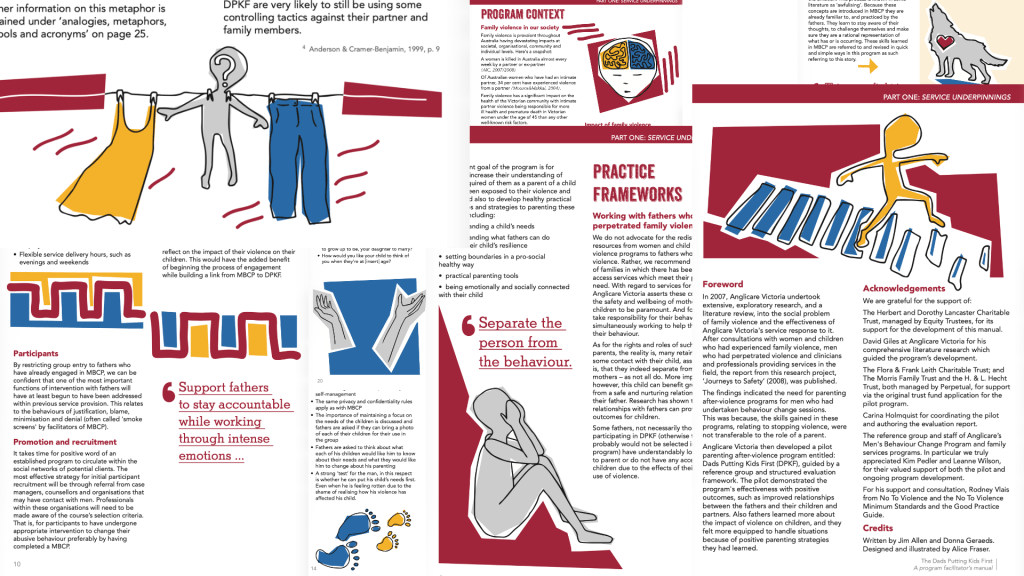
DPKF is a group work program that teaches reparative parenting skills and practices to fathers who have acted violently towards their partner and/or children and subsequently completed a Men’s Behaviour Change program (MBCP). Anglicare Victoria needed an impacting and straightforward design layout for this manual.
Illustration was decided upon to add meaning to, and emphasise the text. Illustration was chosen over photography due to the medium’s inexplicit ability to tell a story with depth and emotion. The three primary colours of red, blue and yellow, with grey as a supporting tone, were chosen as the colour scheme due to their relationship with childhood and education. These colours separate the manual’s chapters.
A carefully selected ensemble of sans serif typefaces were chosen for the copy, to stylistically and simply complement the graphic style of the manual. The DPKF program manual reaches its audience in a highly communicative, impacting and accessible manner.
Cara
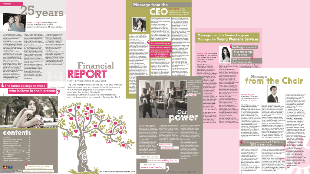
The Cara Nurture and Empower Annual Report was designed with tasteful colour restraint, simplicity to exude optimism and clarity. The organisation’s primary brand colour of bright magenta pink was the highlighting feature hue, with a supporting, earthy olive green, warm grey and white to round out the publication pallette.
Youthful energy bounces around the layouts with highlighted breakout quotes and powerful headings. Subtle and meaningful vector illustrations support the main phorographic images to add further layers to the report’s narrative.
Branding
Logos for services, programs and organisations both locally and nationally. The voice of each design is unique. This is developed through client conversations, briefings, research and observations of existing successful designs within the marketplace.
Understood the Brief Perfectly
“I already had in mind what I wanted, and Alice put it together effortlessly (on my part).
I’m really happy with the result of my logo and motif – exactly what I wanted.“
Yvette Price
Founder, Canterpants

